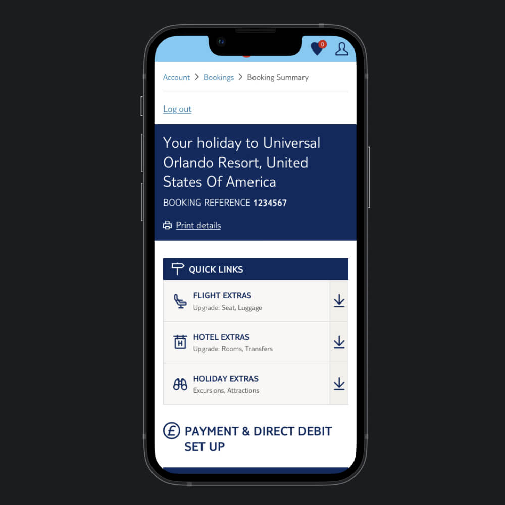
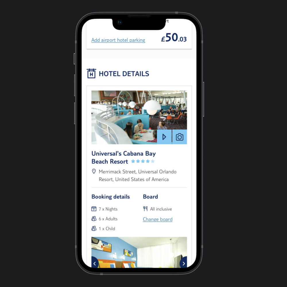
Manage My Booking
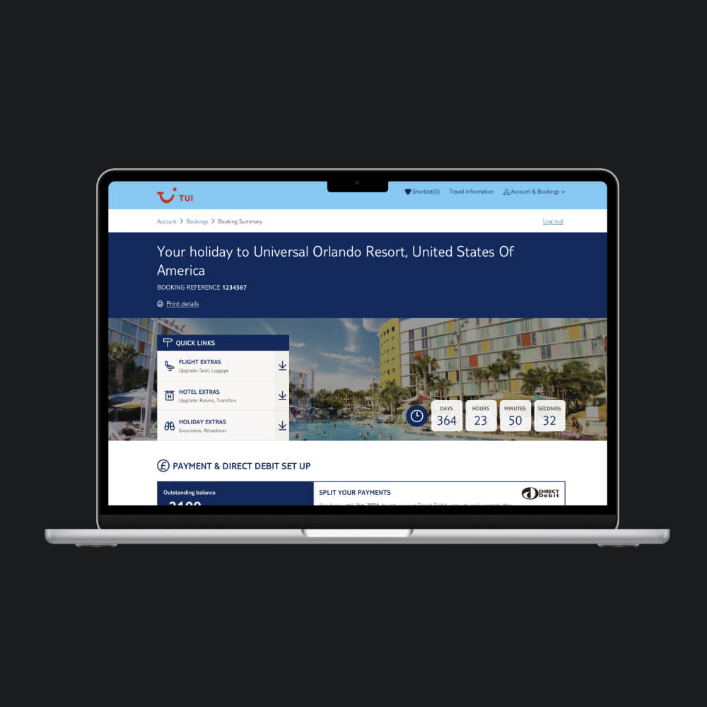
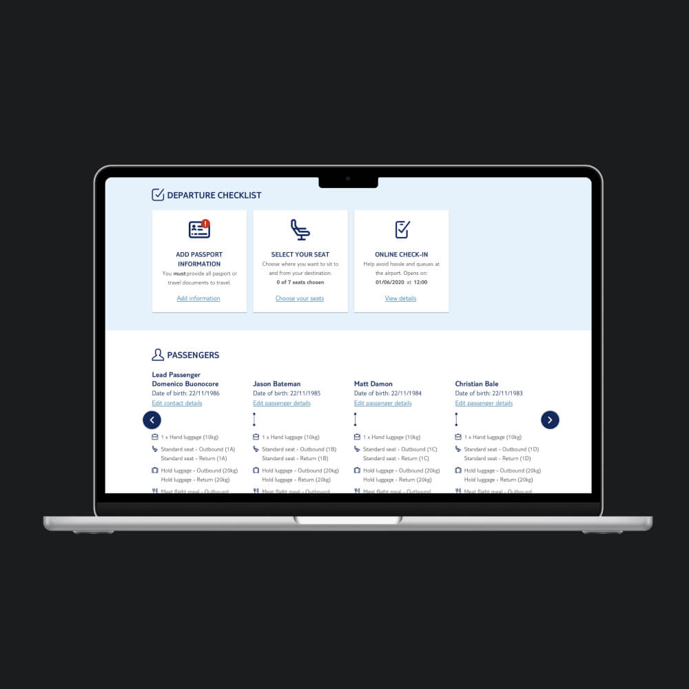
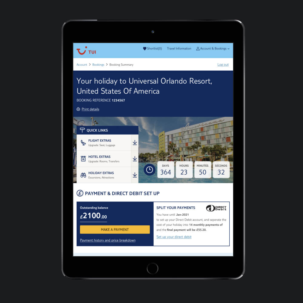
To completely transform the post-booking customer experience (MMB) across all TUI, First Choice and other market holiday packages, whilst integrating it seamlessly into the Sales and Services Technology platform utilised by TUI's in-store retail agents.
Senior UI Designer
UI Research, Analyse Competitor Research, Interface Design, Interaction Design, Wireframing, Analyse User Testing, Design System
- Senior UI Designer (Me)
- Senior UX Designer
- User Researcher
- Scrum Master
- Product Owner / Product Manager
- BA
- Full Stack Developers
- QA
- Figma
- Adobe Photoshop
- Webaim Colour Contrast
- Dribbble
- Mobbin
- Competitors
15 months
Deliverables
Our objectives were threefold:
- Elevate conversion rates by upselling our premium ancillaries
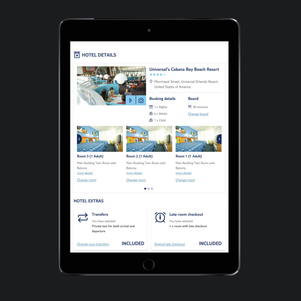
- Develop a set of components that was scalabable across all offered packages and markets such as the Nordics regions
- Ensure adaptability for future integration of the Flight and Ancillaries Extras (FAE) project
Challenges
There are 4 parts to this:
1. Addressing customer pain points
We collected customer insights and analytics from our insights and analytics teams, specifically focusing on beach holiday experiences with Manage My Booking (MMB). These insights steered our redesign, addressing identified pain points.
2. Enhancing ancillary visibility and conversions
We aimed to highlight important ancillaries more visibly after discovering they were hidden in accordions, following competitors' open display approach.
3. Competitor analysis strategies
To grasp competitor strategies without system access, we authorised our researcher to purchase competitor holidays. This provided screenshots for in-depth analysis, distinguishing effective design practices and patterns.
4. Ensuring consistency and integration
Allowing flexibility and scalability across all touch points and in all our other markets too. Not all markets have/use the same ancillaries as TUI UK and Ireland therefore needing to get across the same message using the same components. These were tested tweaked accordingly to have a robust set of components
Ideation
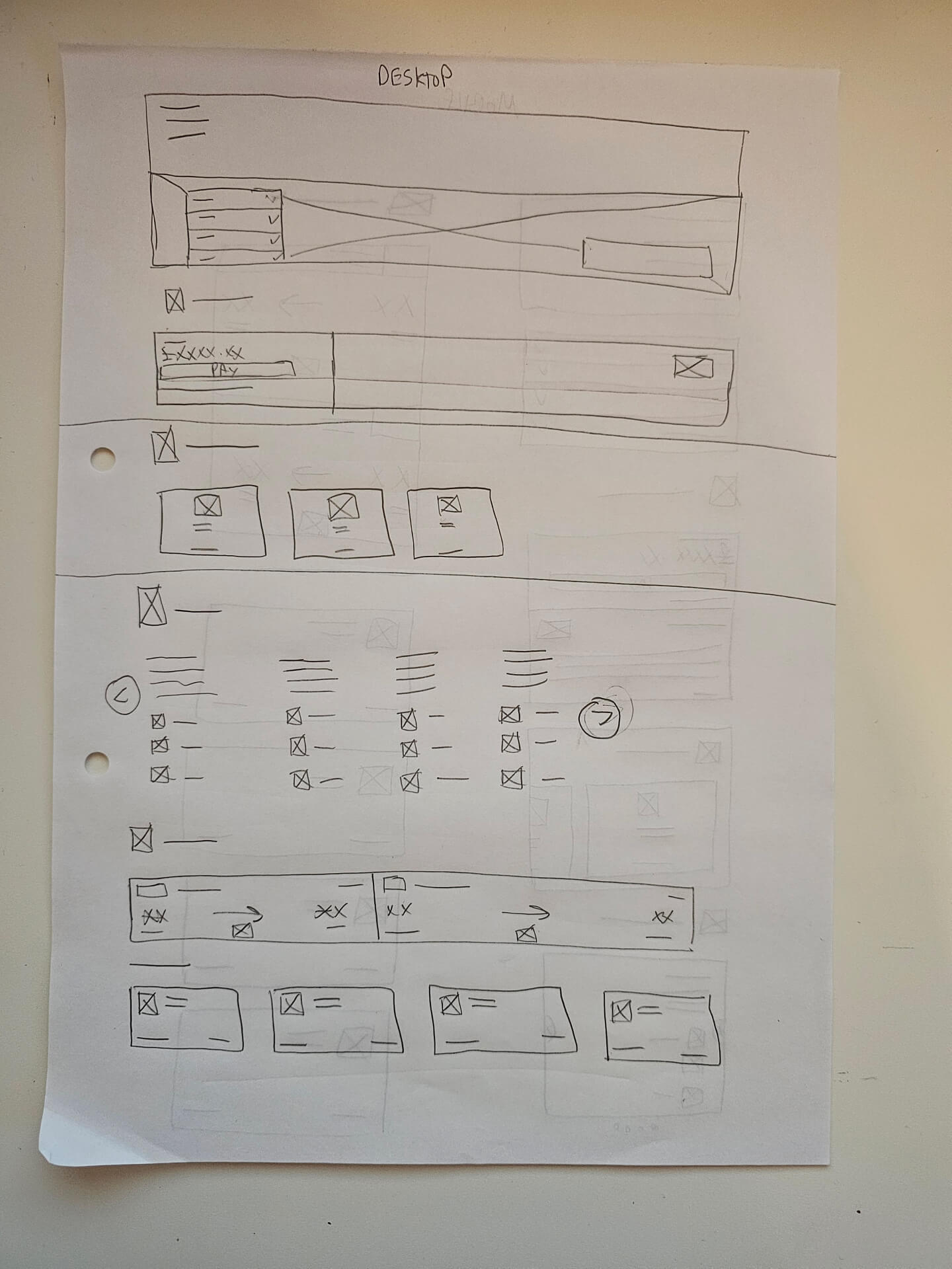
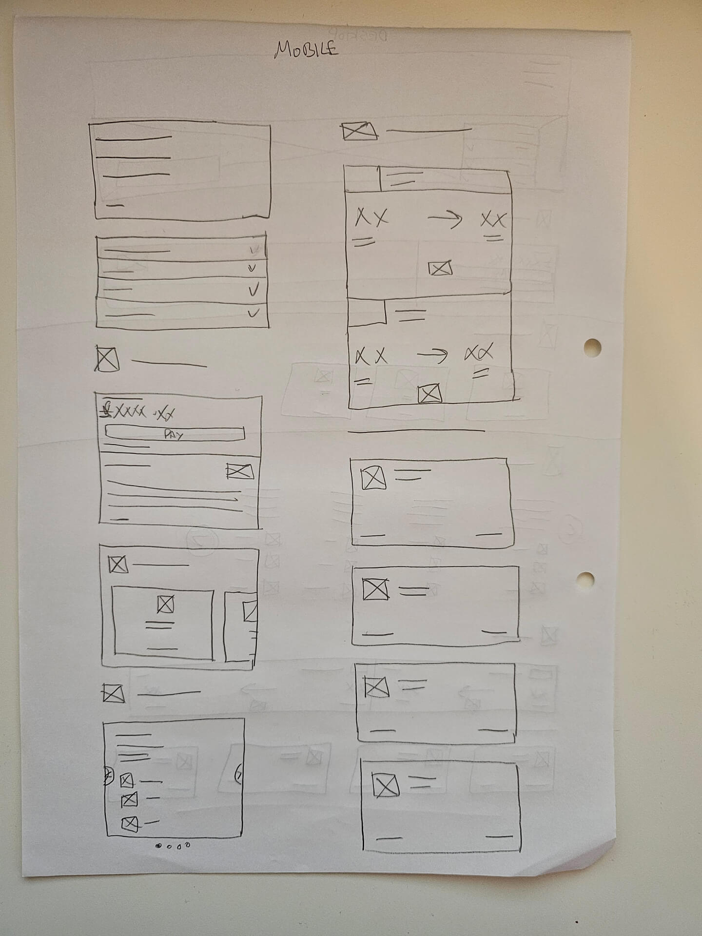
We prioritised features for our MVP and then explored design patterns from competitors and platforms like Mobbin etc. Sketching sessions helped align concepts with TUI's style guide, ensuring scalability across packages and markets. Our goal was to blend successful industry design elements with TUI's style for a cohesive approach, catering to various market needs within our design system.
Below is the one of the sketches we went with:
Testing
We presented wireframes and high-fidelity prototypes back to the team. Working closely with developers to understand technical challenges, we tested extensively from guerrilla testing with internal staff members, through to remote and moderated testing, receiving positive feedback from different user groups and making swift updates where necessary. After testing, we rolled out to UK and Ireland, refining for First Choice and our other markets.
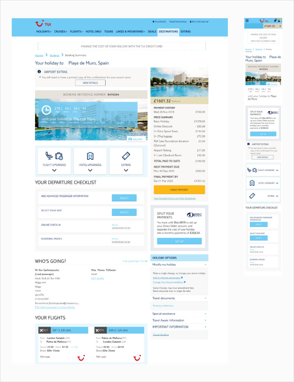
Final Product
Not only did we receive positive feedback that was collected from our insights team, existing pain points were addressed, deliverables were delivered and overall conversion of ancillaries shot up to too!
Before
After
