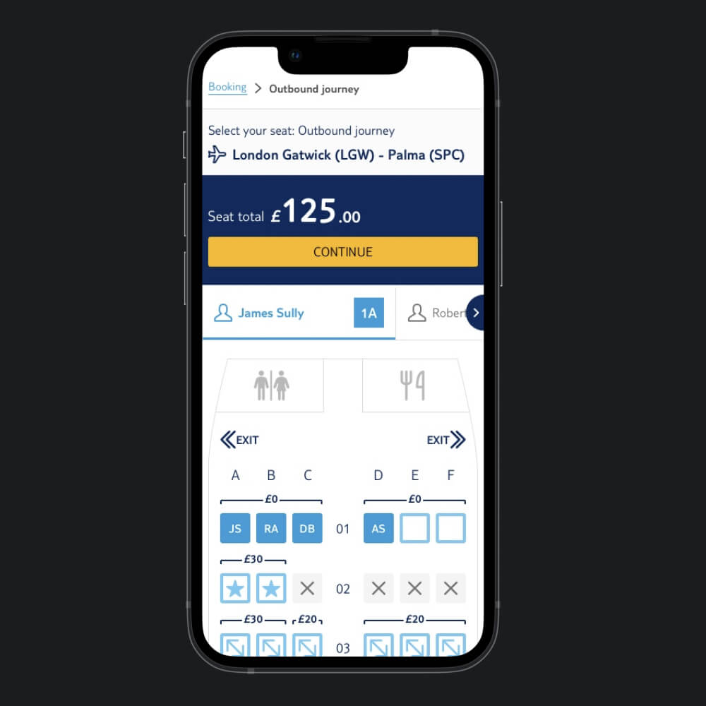
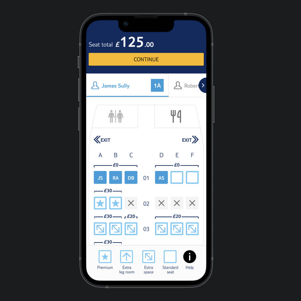
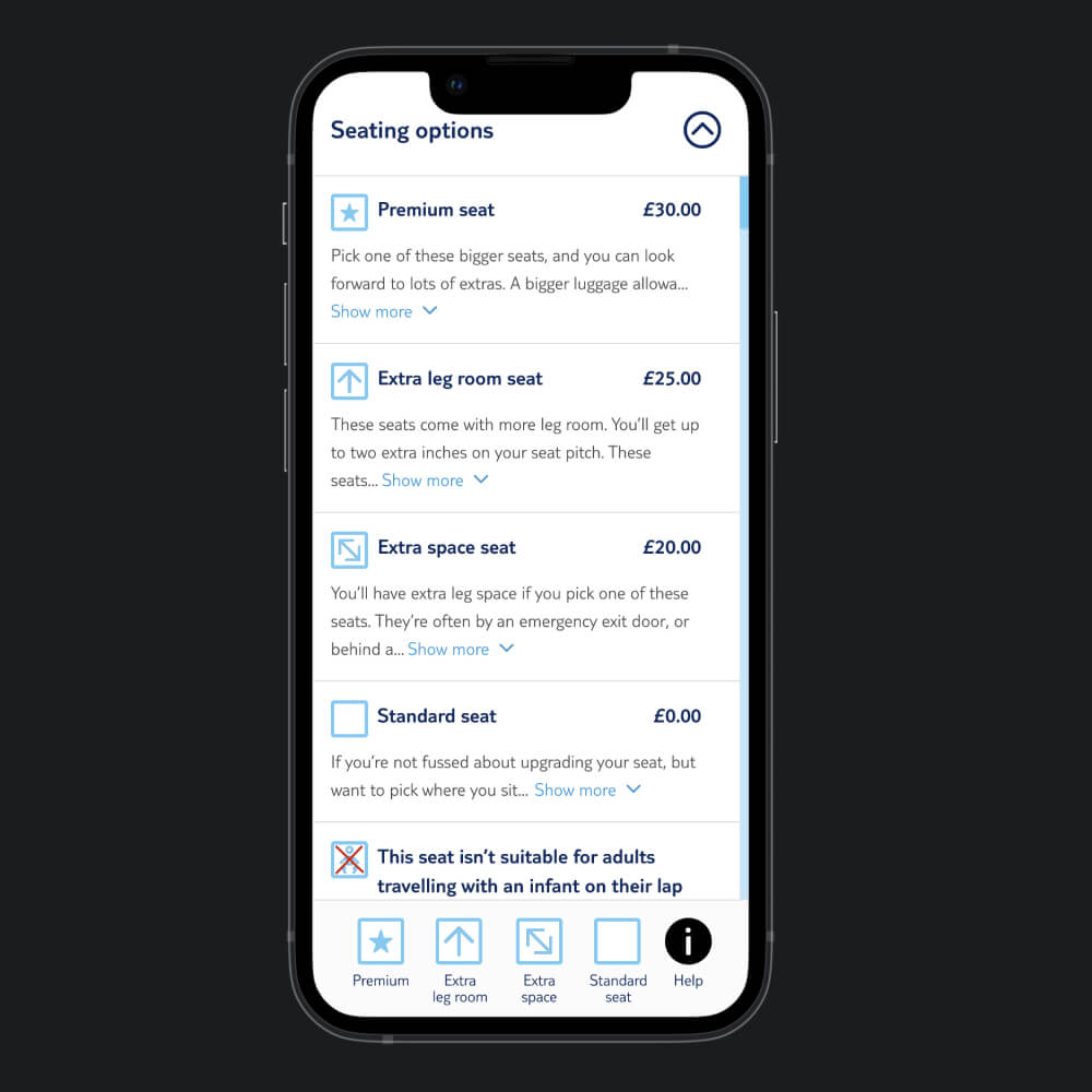
Seat Map
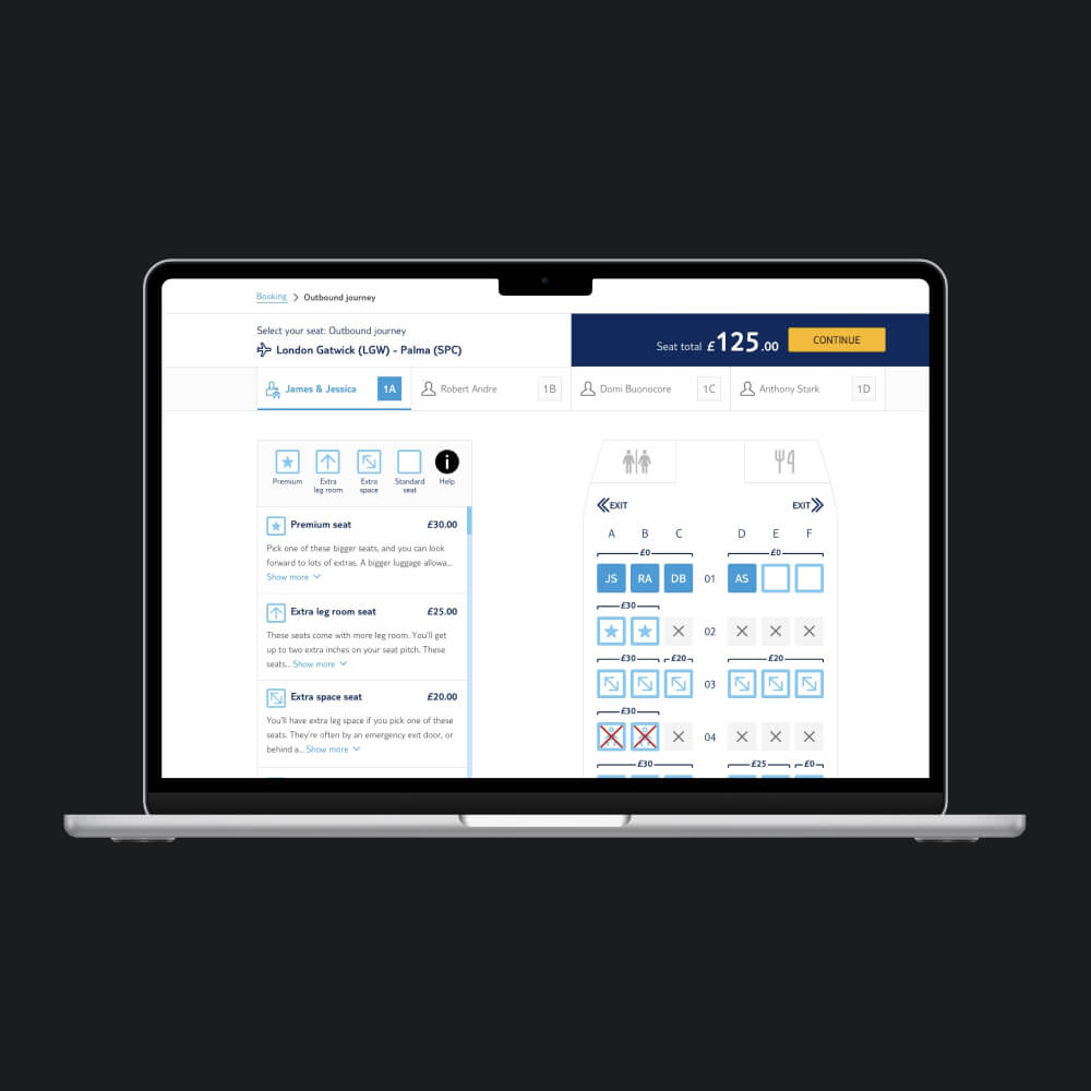
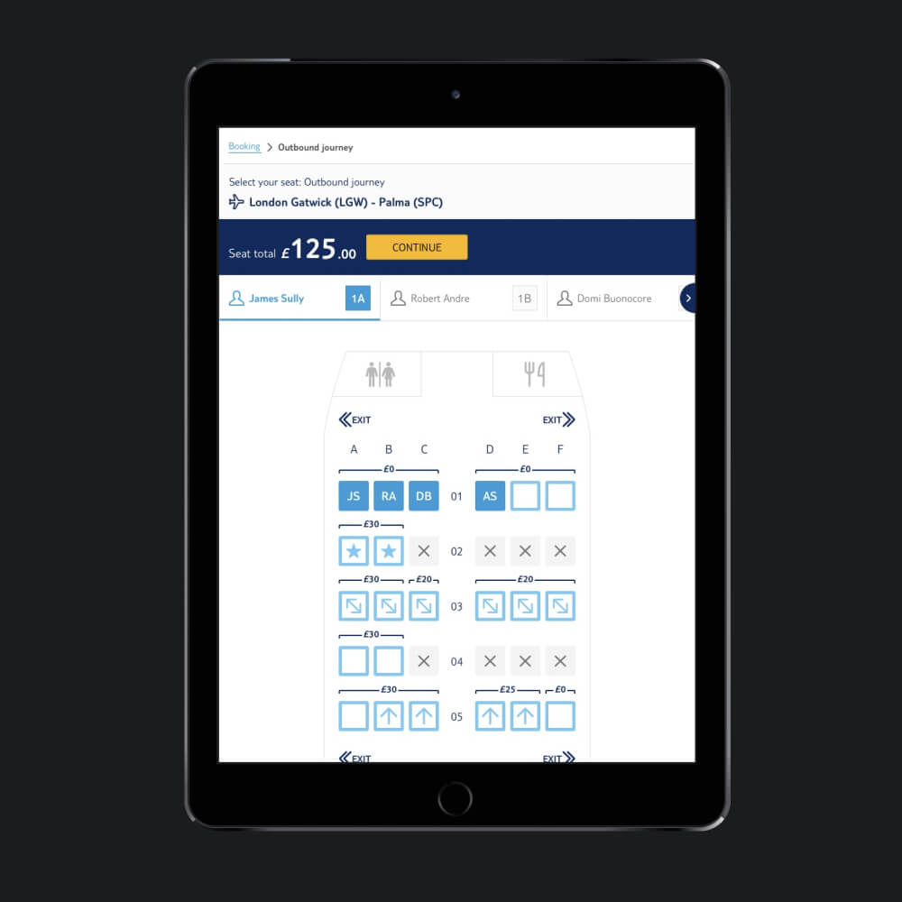
As part of a wider project (Flight and Ancillaries Extras) aimed to combine seat selection, passport input, and online check-in after booking, users faced a subpar experience navigating to a separate site to select their seat. By integrating these features into Manage My Booking (MMB), we created a seamless and smoother user journey.
Senior UI Designer
UI Research, Analyse Competitor Research, Interface Design, Interaction Design, Wireframing, Analyse User Testing, Design System
- Senior UI Designer (Me)
- Senior UX Designer
- User Researcher
- Scrum Master
- Product Owner / Product Manager
- BA
- Full Stack Developers
- QA
- Figma
- Adobe Photoshop
- Adobe Illustrator
- Webaim Colour Contrast
- Dribbble
- Mobbin
- Competitors
14 months
Deliverables
- Integrate the seat map user journey into the bookflow (when users select their seats before paying for the holiday) and the MMB experience
- Ensure consistency across TUI UK and Ireland before being rolled out to the First Choice brand and other markets
Challenges
1. Understanding system constraints with developers
Working closely with our development team, we explored our system's technical intricacies to ensure seamless integration of the seat map within our infrastructure.
2. Pricing structure and localisation challenges
We categorised seat types and devised a dynamic pricing system adaptable to diverse currencies and languages, ensuring effective communication of pricing variations across markets.
3. Iconography and visual communication
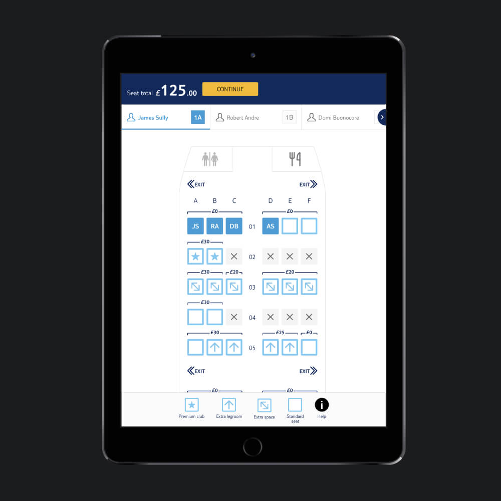
We used clear, universal icons to make seat selection intuitive. These visuals conveyed seat features like window availability and seating rules, ensuring a self-explanatory experience for customers.
4. Seating rules implementation
Implementing seating rules, like prioritising infants and ensuring contiguous seats, demanded careful planning. Creating system algorithms or rules accommodated these preferences during seat allocation.
5. Dynamic aircraft layouts and seat maps
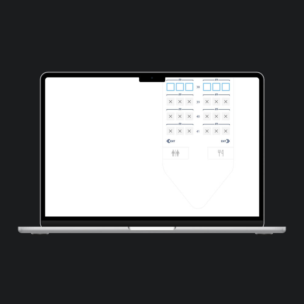
To adapt to changing aircraft layouts, we developed a dynamic seat map system instead of using static imagery. This allowed us to generate accurate and updated seat maps, ensuring adaptability to layout changes for customers.
6. Integration between MMB and Bookflow
Ensuring seat selection compatibility across MMB and initial booking stages was vital. Both journeys had subtle differences therefore were mapped out to ensure what was designed/built was fit for purpose.
Ideation
- UI Research – Competitors/Google
- Icons
- Colours
- Pricing vs Layouts
Competitors

Icon variations (for testing purposes)
Testing
Like MMB, we used several testing methods to ensure we had unanimous results as it was important users understood the rules around selecting their seats and understanding what each icon meant without necessarily needing a key.
We carried out the following testing methods with the icons in isolation and in context (with a key) within the user flow from bookflow to MMB and MMB (if no seats were selected in bookflow) through to seat selection and payment:
- Remote including a survey
- Guerrilla
- Moderated
In the end, #2 won.
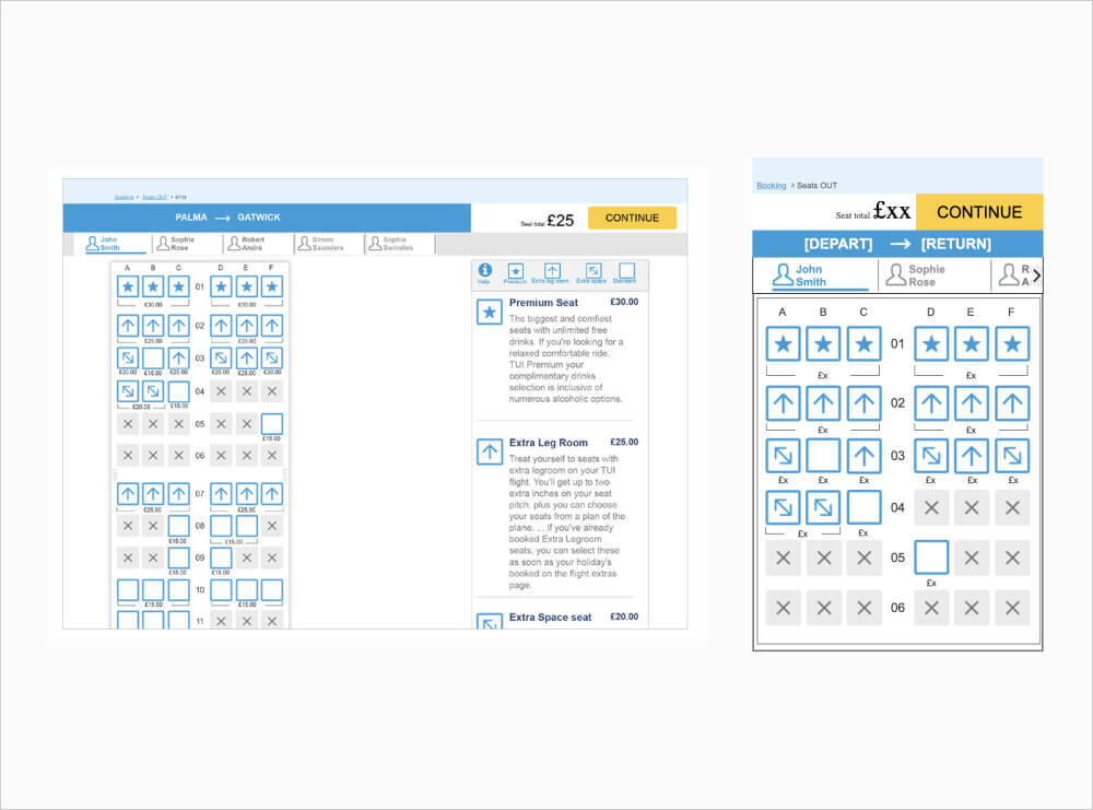
Here is one of the prototypes and user testing produced on the project:
Final Product
Like for MMB, our insights team had positive feedback from our customers, deliverables were met and existing pain points were addressed. In addition we saw an increase uptake of seat upgrades.
Before
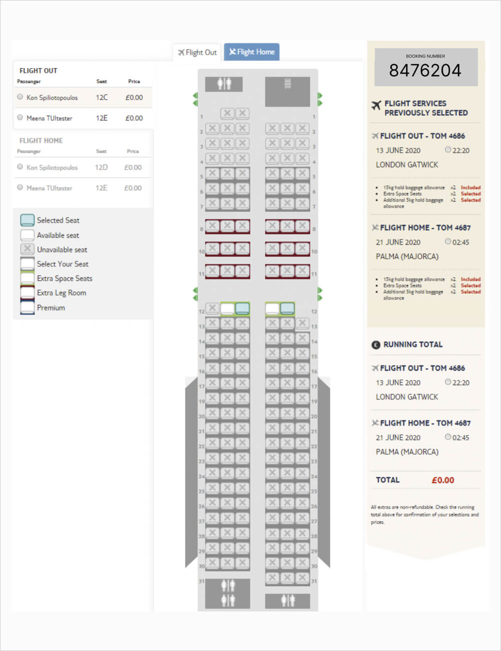
After
